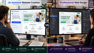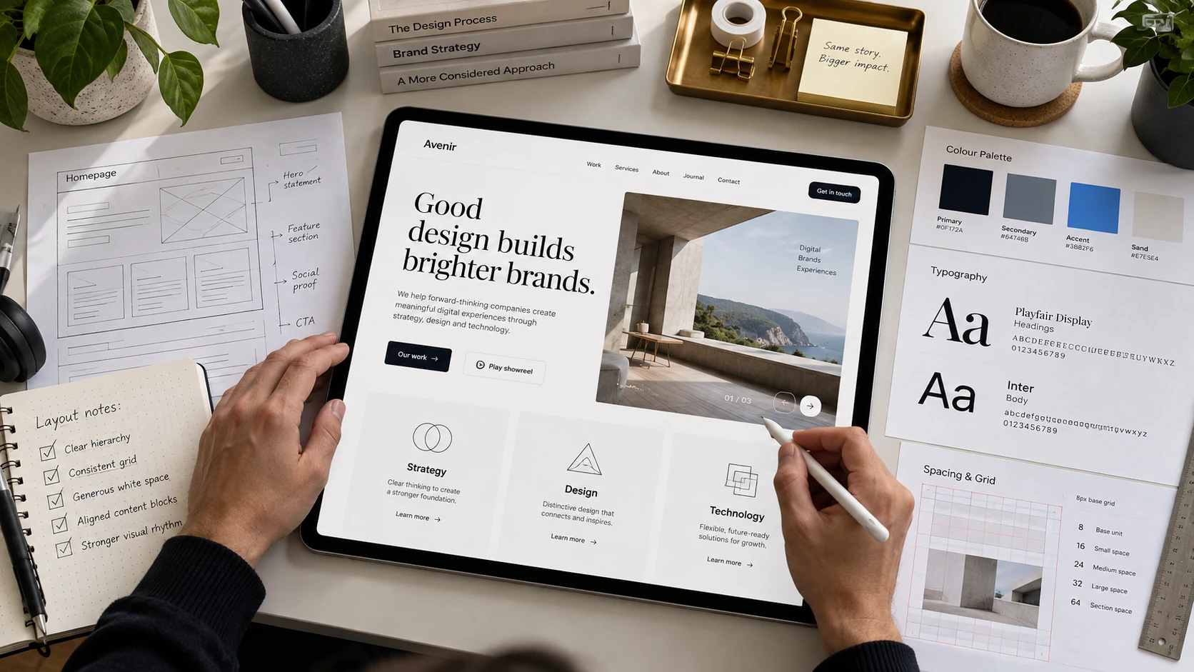
Designing a page involves organizing content, selecting colors and fonts, creating visual hierarchy, and arranging elements into a balanced layout. A well-designed page should communicate information clearly while guiding visitors toward important actions. Understanding how to design a page also requires attention to spacing, alignment, readability, and accessibility. These principles apply to website pages, landing pages, and other digital layouts.
You do not need advanced design experience to create an attractive page. With proper planning and a few essential principles, beginners can develop professional layouts. The following guide explains the design process, from defining a page’s purpose to refining its final appearance.
Defining The Purpose Of Your Page
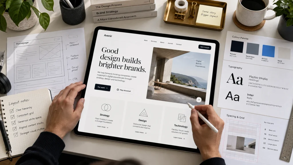
Every effective page starts with a clear objective. Before choosing colors or arranging images, decide what the page should accomplish. A product page may encourage purchases, while a service page focuses on customer inquiries. Similarly, an informational page helps visitors understand a particular subject. Identifying the primary objective makes it easier to choose relevant content and eliminate unnecessary elements.
Consider your target audience and the information they expect to find. For example, a restaurant page might require menu details, operating hours, and reservation options. A portfolio page may prioritize project images and professional experience. Once you understand these requirements, identify the most important message and supporting information. This approach helps create a page that serves visitors instead of simply displaying attractive graphics.
Choosing The Right Page Dimensions And Layout
Page layout determines how content appears and how visitors move through it. When learning how to design a page, begin with a simple structure that includes clearly separated sections. Website pages commonly use a header, main content area, and footer. Within the main area, designers can arrange text, images, cards, and buttons using columns or flexible containers. Avoid placing too many elements within a single section because overcrowded layouts make information difficult to follow.
Page dimensions should adapt to the viewing device rather than follow one fixed width. Desktop layouts provide space for multiple columns, while mobile designs generally require a simpler arrangement. Use responsive containers and appropriate margins to maintain balance. For example, a two-column section featuring text and an image may become a vertical layout on smartphones. Planning these adjustments early helps prevent spacing problems during development.
Understanding Visual Hierarchy And Alignment
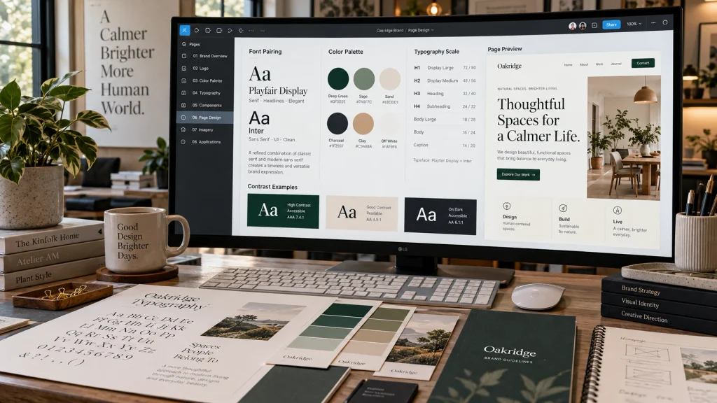
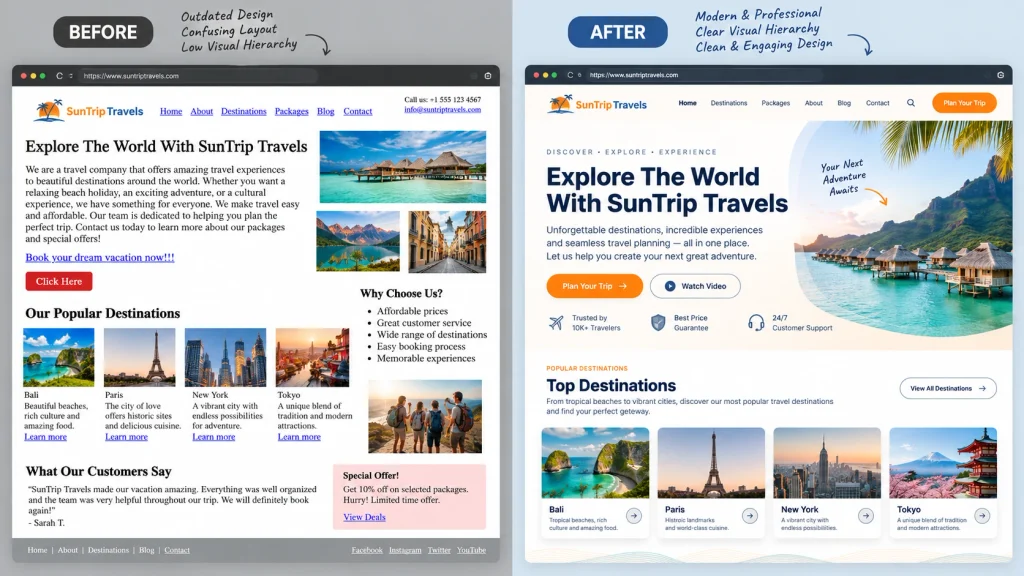
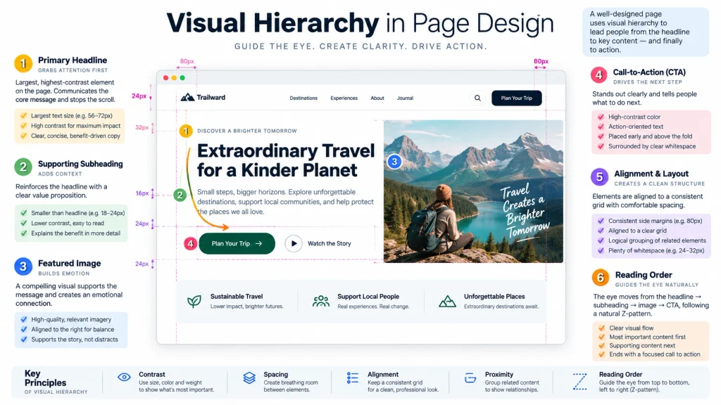
Visual hierarchy guides attention toward the most important elements on a page. Designers establish hierarchy through font sizes, colors, contrast, positioning, and spacing. A prominent headline usually attracts attention first, followed by supporting text and relevant visuals. Important buttons should also stand out without competing with the main message. When every element receives equal emphasis, visitors may struggle to identify what matters.
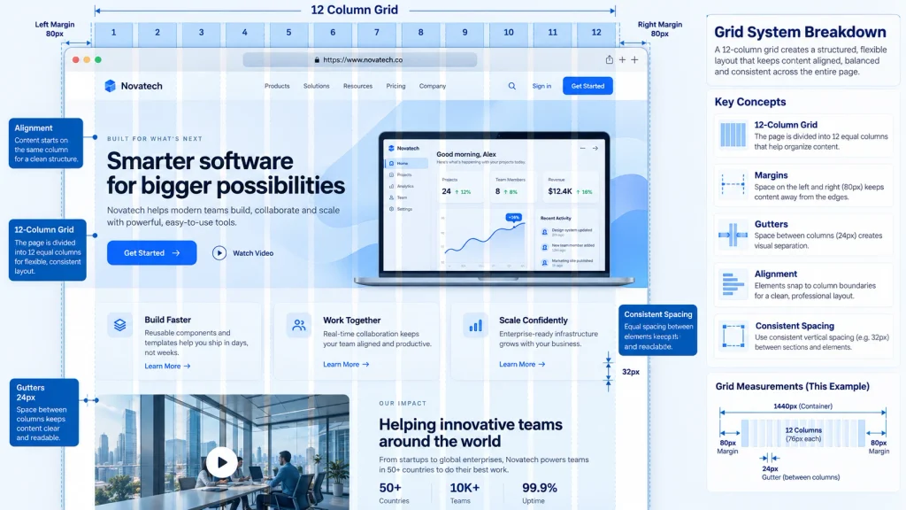
Alignment creates order by connecting elements visually. Text blocks, images, and buttons should follow consistent positioning rules. For example, a left-aligned heading should usually connect naturally with the content below it. Grid systems can help maintain consistent spacing between columns and sections. When exploring how to design a page effectively, combining clear hierarchy with careful alignment makes layouts easier to understand. These principles also create a more polished appearance without unnecessary decorative elements.
Using White Space And Balanced Spacing
White space refers to the empty areas surrounding text, images, buttons, and other design elements. It does not need to be white because the term describes available space rather than a specific color. Proper spacing separates information and makes individual sections easier to recognize. Without sufficient space, even useful content can appear crowded and overwhelming.
Establish consistent margins and padding throughout the page. For example, keep similar distances between headings and their supporting paragraphs. Use larger gaps to separate major sections and smaller gaps for closely related elements. However, avoid excessive spacing that disconnects related information. A balanced layout provides enough room for content without making visitors scroll unnecessarily. Professional web design services can help businesses create layouts that combine clear spacing, visual consistency, and practical usability.
Selecting Effective Typography And Colors
Typography influences how comfortably visitors read page content. Choose fonts that remain clear across different screen sizes and maintain consistent sizes for headings and body text. Avoid using several unrelated typefaces because they can make the page appear inconsistent. Line spacing also matters, especially for longer paragraphs. Google’s web typography guide explains how text size, line length, and spacing contribute to readable digital layouts.
Color selection should support branding while maintaining readability. Choose a limited palette with primary, supporting, and neutral colors. Use sufficient contrast between text and backgrounds so visitors can distinguish important information. For example, dark text on a light background often provides comfortable reading conditions. Bright accent colors can highlight buttons or important details without overwhelming the entire layout. Consistent typography and colors help establish a recognizable design style.
Arranging Text, Images, And Visual Elements
Text and images should work together to communicate information. Start each section with a descriptive heading, followed by content that explains the topic. Place supporting images near the relevant text so visitors can understand their purpose. For example, a product description should appear close to its photograph and purchasing information. Avoid placing unrelated graphics between connected pieces of content.
When considering how to design a page, prioritize relevant images instead of decorative visuals. Use high-quality photographs, illustrations, or icons that reinforce the message. Maintain consistent image proportions and prevent unnecessary stretching or cropping. Additionally, organize text into readable paragraphs rather than large, uninterrupted blocks. Buttons should appear near the information that supports their purpose. A thoughtful arrangement creates a natural reading experience and encourages visitors to explore the page.
Creating A Consistent And Accessible Design
Consistency helps visitors understand how different page elements function. Buttons, headings, navigation links, and content sections should follow recognizable design patterns. For example, use the same button style for primary actions throughout the page. Maintain consistent border radii, spacing, and typography. These details create a professional appearance and reduce confusion when visitors interact with the design.
Accessibility ensures that people with different abilities can use the page effectively. Use readable text, suitable color contrast, descriptive links, and alternative text for informative images. Interactive elements should also support keyboard navigation. Avoid relying entirely on color to communicate important information. Businesses that require custom layouts or advanced functionality can explore web development services. Combining accessible design with reliable functionality improves the experience for a wider audience.
Reviewing And Refining The Final Page
After completing the initial layout, review the page from a visitor’s perspective. Check whether the headline communicates its purpose and whether supporting content follows a logical order. Examine spacing, alignment, typography, and image quality. Pay particular attention to the placement of important buttons. A page may look attractive during editing but become difficult to use on smaller screens.
Test the layout on desktop computers, tablets, and smartphones. Check for overlapping content, unreadable text, and images that extend beyond their containers. Ask other users to complete simple tasks and observe where they encounter difficulties. You can also review engagement and conversion data after publication. Understanding how to design a page includes making improvements based on actual results. Regular refinements help maintain usability as content and visitor expectations change.
Conclusion
Learning how to design a page starts with understanding its purpose and organizing information clearly. Effective layouts use visual hierarchy, balanced spacing, readable typography, and relevant images. Consistent styling also creates a professional appearance and helps visitors recognize important elements. A successful page should remain accessible and functional across different devices. Reviewing layouts, testing interactions, and refining details help improve the final result.
At Best Website Builder Group, businesses can access professional website design and development solutions. These services help create organized, responsive pages that support user experience and business objectives.