
Website responsiveness is a crucial factor in SEO, user experience, and overall site performance. With the growing number of users accessing websites from mobile devices, search engines like Google prioritize responsive websites in their rankings. A site that adapts seamlessly to different screen sizes and devices enhances user engagement, reduces bounce rates, and ultimately improves search rankings.

What is Website Responsiveness?
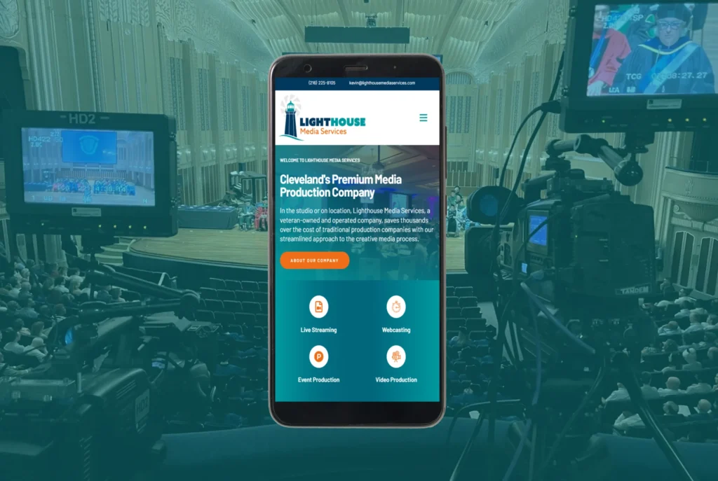
Website responsiveness refers to a site’s ability to automatically adjust its layout, content, and images to fit various screen sizes. A responsive website ensures that whether a visitor is using a desktop, tablet, or smartphone, the site remains functional, visually appealing, and easy to navigate.
The concept of responsive web design (RWD) was introduced to accommodate the rise in mobile browsing. Unlike fixed-width designs, responsive websites use flexible grids, media queries, and scalable images to create an optimal viewing experience across different devices. We cover a lot of this in our article what is responsive web design.

Why Website Responsiveness Matters for SEO
Google has shifted towards a mobile-first indexing approach, meaning it primarily considers the mobile version of a website for ranking purposes. Websites that are not mobile-friendly suffer in search rankings, leading to lower visibility and fewer visitors. Here’s how website responsiveness impacts SEO:
1. Improved User Experience
A responsive website enhances usability, making it easier for visitors to browse, read content, and interact with the site. When users can effortlessly navigate a site on any device, they are more likely to stay longer, reducing bounce rates and increasing engagement metrics—both of which are essential ranking factors for search engines.
2. Faster Page Load Speeds
Website speed is a key SEO ranking factor. Responsive websites load faster on mobile devices because they use optimized images, streamlined CSS, and adaptive layouts. Faster loading times reduce visitor frustration and prevent potential customers from leaving the site prematurely.
3. Lower Bounce Rates
A high bounce rate occurs when users visit a page but leave without interacting further. Unresponsive websites often have higher bounce rates because they provide poor mobile experiences. Search engines interpret a high bounce rate as a signal that the website isn’t relevant or user-friendly, which can lead to lower rankings.
4. Avoidance of Duplicate Content Issues
Some websites create separate mobile and desktop versions using different URLs (e.g., “m.example.com” for mobile). This can cause duplicate content issues, as search engines struggle to determine which version to prioritize. A responsive design eliminates this problem by maintaining a single URL that works across all devices.

Key Elements of a Responsive Website
To achieve a fully responsive website, certain design and development principles must be implemented. Here are the critical elements that contribute to website responsiveness:
1. Flexible Grid Layouts
A flexible grid layout uses relative units like percentages instead of fixed pixels. This ensures that elements resize proportionally, adjusting seamlessly to different screen sizes.
2. Adaptive Images and Media
Images should be scaled and optimized for different devices. Using CSS properties like max-width: 100% ensures that images resize dynamically. Additionally, modern formats like WebP reduce file size without sacrificing quality, improving page load speed.
3. Mobile-Friendly Navigation
Traditional desktop menus may not work well on smaller screens. Implementing a hamburger menu, collapsible navigation, or thumb-friendly buttons improves usability on mobile devices.
4. Touch-Friendly Elements
On mobile devices, users navigate by touch rather than a mouse. Buttons, links, and interactive elements should be large enough to tap easily, preventing accidental clicks.
5. Optimized Typography
Text must be readable without zooming. A minimum font size of 16px is recommended for mobile screens, and proper line spacing ensures text remains easy to read.

Testing Website Responsiveness
To ensure a website is fully responsive, businesses should regularly test their site using various tools:
- Google’s Mobile-Friendly Test – Checks if a website meets mobile usability standards.
- Responsive Design Mode in Chrome DevTools – Allows developers to preview their site on different screen sizes.
- Screenfly and BrowserStack – Simulate how a website appears across multiple devices and browsers.
Regular testing ensures that updates or new content do not negatively impact the site’s responsiveness.

How to Improve Website Responsiveness
If a website isn’t fully responsive, there are several strategies to enhance its adaptability across different devices:
1. Implement a Mobile-First Design Approach
Mobile-first design prioritizes the mobile experience before scaling up to larger screens. This ensures that essential content is easily accessible on smaller devices and then progressively enhanced for desktops.
2. Use Responsive Frameworks
Frameworks like Bootstrap and Foundation provide pre-built responsive components, making it easier to create flexible layouts. These frameworks include built-in media queries, ensuring consistent responsiveness across devices.
3. Optimize Images and Media Files
Large images slow down page speed, affecting both user experience and SEO. Compressing images and using adaptive image loading techniques (e.g., lazy loading) can improve responsiveness.
4. Enable Viewport Meta Tag
The viewport meta tag helps browsers adjust a site’s layout based on the device’s screen size. Adding the following code to a website’s HTML ensures proper scaling:
<meta name="viewport" content="width=device-width, initial-scale=1">This prevents content from appearing too small or requiring horizontal scrolling.
5. Minimize CSS and JavaScript
Excessive CSS and JavaScript can slow down loading times on mobile devices. Minifying files and using asynchronous loading techniques ensure that resources load efficiently.
6. Improve Touchscreen Usability
Buttons and interactive elements should be at least 48px by 48px to accommodate touchscreen users. Ensuring a clear tappable area improves usability and reduces frustration.
The Impact of Website Responsiveness on Conversions
Beyond SEO benefits, a responsive website plays a critical role in conversions and revenue generation. Statistics show that 57% of users won’t recommend a business with a poorly designed mobile site, and 40% of users will switch to a competitor after a bad mobile experience.
A well-optimized responsive website encourages users to complete actions such as filling out forms, making purchases, or signing up for newsletters. This leads to improved lead generation and higher conversion rates.

How Best Website Builder Group Can Help
At Best Website Builder Group, we specialize in developing high-performance, responsive websites that enhance user experience and SEO rankings. Our services include:
- Responsive web design and development to ensure seamless adaptability across devices.
- Mobile performance optimization to improve load times and user engagement.
- SEO enhancements to align with Google’s mobile-first indexing and ranking factors.
- Ongoing maintenance and testing to keep your website fully responsive and optimized.
If your website isn’t mobile-friendly or suffers from responsiveness issues, our expert team can help transform it into a fast, user-friendly, and SEO-optimized platform. Contact us today to ensure your website meets the highest industry standards and attracts more traffic and conversions.
