
A strong online presence does more than look attractive. It helps visitors understand a business, find useful information, and complete an important action without unnecessary effort. This is why business owners often ask what makes a website a good website when planning a new online presence or reviewing an existing one.
Several elements work together to create a positive experience. These include clear design, simple navigation, useful content, fast performance, mobile responsiveness, trust signals, accessibility, and search visibility. None of these areas works well in isolation. An attractive design can still fail when pages load slowly. Helpful content may also go unnoticed when visitors cannot find it easily.
Best Website Builder Group focuses on building sites around business goals rather than appearance alone. Design should support visitors from the moment a page loads until they take the next step. Understanding the main qualities of an effective site can help businesses identify what already works and which areas need improvement.
What Makes A Website A Good Website?
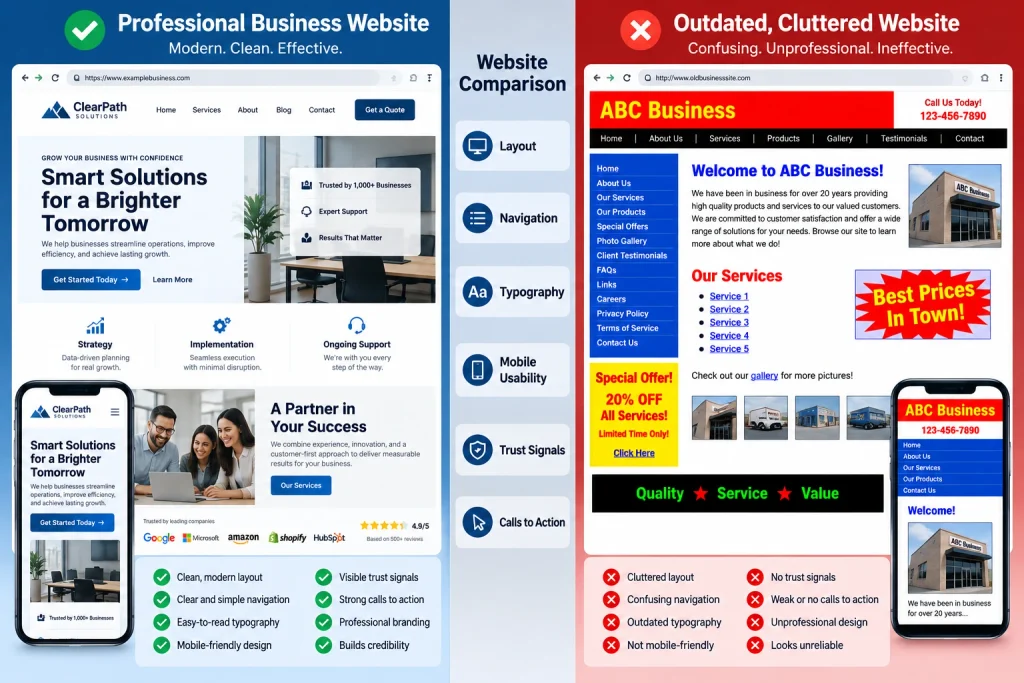
An effective site gives visitors a clear understanding of its purpose almost immediately. Someone arriving on a business homepage should quickly recognize what the company offers, who it serves, and what action they can take next. Clear headlines, useful supporting text, relevant images, and visible calls to action make this easier. Visitors should not have to search through several sections before understanding the main offer.
Consistency is equally important. Navigation, colors, typography, buttons, spacing, and page structure should follow a recognizable system. This makes the experience easier to understand because people know what to expect as they move between pages. Businesses that want this type of structured experience can use professional web design services from Best Website Builder Group. Strong design combines visual quality with usability, helping users explore information and complete important tasks without unnecessary confusion.
Clear Navigation Makes Information Easy To Find
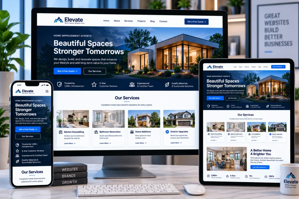
Navigation plays a major role in usability. The main menu should include the pages visitors are most likely to need, using labels that clearly describe each destination. A service company might include Services, About, Contact, and relevant service categories. An ecommerce store may prioritize Shop, Categories, Account, and Cart. Complicated menu names can make simple information unnecessarily difficult to locate.
The structure should remain logical beyond the main menu. Related pages can connect through internal links, breadcrumbs, category pages, or contextual calls to action. Important information should not be buried several levels deep without a clear route. A visitor who reaches a service page should understand how to learn more, contact the company, or explore related offerings. Simple navigation reduces friction and gives people more confidence while browsing. It also makes larger sites easier to manage because each page has a clear place within the overall structure.
Useful Content Answers Visitor Questions
Strong content should help people make decisions. Instead of filling pages with generic marketing statements, businesses should explain what they offer, how it works, who it helps, and what customers can expect. Service pages should answer practical questions about the service. Product pages should explain features, benefits, specifications, pricing, or purchasing details where appropriate. Useful information gives people a reason to stay and continue exploring.
Content also needs to be easy to scan. Clear headings, focused paragraphs, descriptive labels, and logical organization make longer pages easier to understand. Search engines benefit when the primary subject of each page is clear. Businesses that want to connect useful content with search demand can use professional SEO services from Best Website Builder Group. Search optimization works best when the content genuinely serves visitors rather than repeating phrases simply to influence rankings. Helpful information should remain the priority.
Fast Performance Improves User Experience
Visitors expect pages to respond quickly. Large images, excessive scripts, unnecessary plugins, complex animations, and poorly optimized code can make browsing feel slow. Even a visually impressive page becomes frustrating when users have to wait for information to appear. Images should be properly sized and compressed, while features that provide little value should be removed.
Performance should be tested across important pages instead of judging the entire site by the homepage alone. Google’s official page experience guidance recommends evaluating the complete user experience rather than focusing on one isolated measurement. Core Web Vitals are part of that wider assessment. Speed therefore affects both technical quality and usability. The goal should not be chasing a perfect testing score at the expense of design. Businesses should aim for pages that load reliably, respond quickly to interactions, and remain visually stable while people browse.
Mobile Users Need The Same Quality Experience
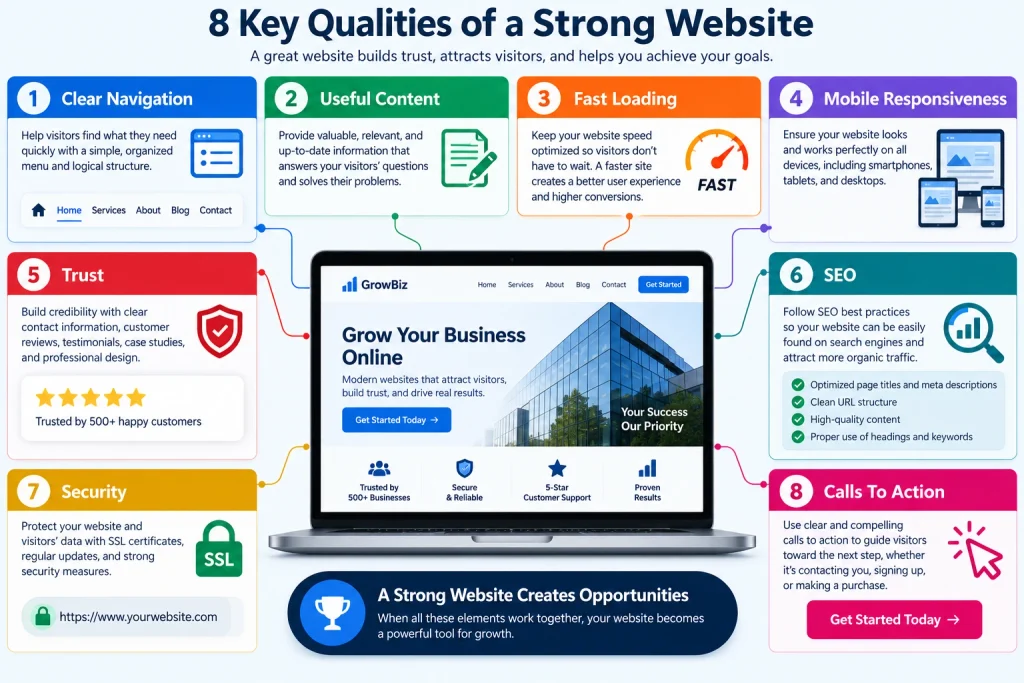
Modern online experiences must work properly across smartphones, tablets, laptops, and desktop screens. Responsive design allows layouts to adjust according to the amount of available space. Columns may stack vertically, menus may collapse, images may resize, and typography may change. These adjustments make content easier to use without forcing mobile visitors to zoom or scroll sideways.
Responsive software handles some adjustments automatically, but important pages should still be reviewed manually. Buttons need enough space for touch interaction, forms should remain easy to complete, and essential information should appear in a sensible order. Large desktop banners may need different spacing or image positioning on smaller screens. Businesses should also check whether mobile visitors can quickly call, request a quote, purchase a product, or complete another important action. Mobile design should provide a complete experience rather than feeling like a reduced version of the desktop layout.
Trust Signals Build Business Credibility
Visitors often evaluate a company before contacting it. The online experience should therefore provide clear signs that the business is legitimate and dependable. Accurate contact information, professional branding, customer reviews, testimonials, project examples, business details, and clear policies can all help build confidence. The most useful trust signals depend on the company. An ecommerce store may need return and shipping information, while a service business may benefit more from reviews and examples of completed work.
Small mistakes can weaken credibility. Broken links, outdated copyright dates, poor-quality images, inconsistent branding, missing contact information, or obvious spelling errors can make a company appear neglected. Security also matters, especially when visitors submit forms, create accounts, or make payments. HTTPS should be used throughout the site, and sensitive information should be handled carefully. Professional design cannot guarantee trust, but it can remove many of the issues that cause potential customers to hesitate.
Clear Calls To Action Support Conversions
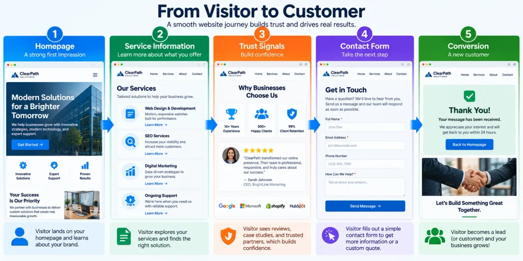
Most business sites exist for a reason beyond simply presenting information. A service company may want visitors to request a quote, call, schedule an appointment, or complete a contact form. An ecommerce business may want shoppers to add products to a cart or begin checkout. Informational sites may encourage newsletter subscriptions or visits to another important page.
Calls to action should appear where they make sense within the user journey. A prominent button near the top can help visitors who are already ready to act, while additional prompts can appear after supporting information. Avoid filling every section with several competing buttons. Too many options can reduce clarity rather than improve results. People should receive enough information to make a decision before being pushed toward a high-commitment action. Strong page design balances information with direction, giving visitors a clear and simple path toward the next step.
A Strong Online Presence Requires Ongoing Improvement
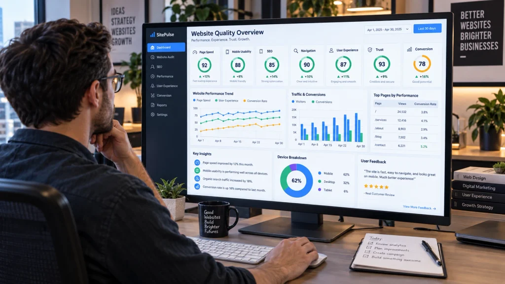
Launching a site should not mark the end of the work. Businesses change, customer expectations evolve, content becomes outdated, and technical problems can develop over time. Regular reviews help identify broken links, old information, slow pages, weak calls to action, and sections that no longer support current goals. Analytics can also reveal which pages attract visitors and where people leave without completing an action.
The qualities that create an effective online presence ultimately work together. Clear design, useful information, simple navigation, reliable performance, mobile usability, credibility, and strong conversion paths all contribute to the overall experience. Businesses should review these areas together instead of improving one while ignoring the others. Best Website Builder Group helps businesses create and improve professional sites with attention to responsive design, user experience, performance, SEO, and measurable goals. Continuous improvement allows a company’s digital presence to remain useful as both the business and its customers change.
