
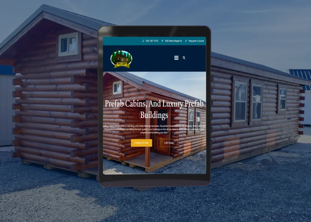
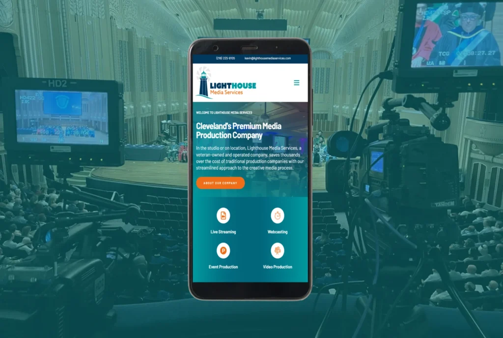
Responsive web design is an approach to web development that ensures websites function and display optimally across a wide range of devices, screen sizes, and resolutions. With the increasing diversity of devices used to access the internet, including smartphones, tablets, laptops, and desktops, responsive design has become a necessity. This technique allows a single website to dynamically adjust its layout and content based on the user’s device, ensuring a seamless and engaging experience without requiring separate mobile and desktop versions.
At its core, responsive web design aims to enhance user experience by providing easy navigation, readable text, and properly scaled images regardless of screen size. A well-designed responsive site eliminates the need for excessive zooming, horizontal scrolling, or distorted layouts, creating a more intuitive browsing experience. By using flexible grids, fluid images, and CSS media queries, responsive design ensures that websites look and function consistently across various devices.

The Importance of Responsive Web Design
The rise of mobile browsing has made responsive design more critical than ever. A significant percentage of internet users access websites from their smartphones, and a site that isn’t mobile-friendly can lead to high bounce rates and lost potential customers. Search engines like Google prioritize mobile-friendly websites, meaning responsive design directly impacts SEO rankings and online visibility.
Moreover, a responsive website helps businesses build credibility and trust. A seamless, well-structured site improves user engagement and reduces frustration, making visitors more likely to stay, browse, and convert into customers. In contrast, a non-responsive site can appear outdated or unprofessional, leading to a negative perception of the brand.
How Responsive Web Design Works
Responsive web design relies on three main components: flexible grids, flexible images, and CSS media queries. Flexible grids use relative units like percentages instead of fixed units like pixels, allowing elements to scale proportionally across different screen sizes. This ensures that text, images, and other elements adjust dynamically without breaking the layout.
Flexible images are designed to resize within their containing elements, preventing them from overflowing beyond the screen width or becoming pixelated. Techniques like CSS max-width properties help maintain image quality while adapting to various screen dimensions.
CSS media queries enable websites to detect the screen size of the user’s device and apply specific styles accordingly. This allows designers to optimize the layout, typography, and content positioning based on different breakpoints, ensuring an optimal experience for all users.

The Benefits of Responsive Web Design
One of the primary advantages of responsive design is improved usability. Visitors can effortlessly navigate a site without the frustration of zooming in or scrolling sideways, making it more likely that they will stay longer and engage with the content. This increased engagement translates to higher conversion rates, whether the goal is to generate leads, drive sales, or increase newsletter sign-ups.
From a cost perspective, responsive design eliminates the need to maintain multiple versions of a website. In the past, businesses often developed separate mobile and desktop sites, leading to increased maintenance efforts and costs. With a responsive approach, a single website adapts to all devices, simplifying updates and ensuring a consistent brand experience.
Another key benefit is search engine optimization (SEO). Google and other search engines favor mobile-friendly sites in their rankings, meaning a responsive design can directly impact visibility and traffic. By ensuring a seamless experience across devices, businesses can improve their organic search rankings and reach a larger audience.
The Future of Responsive Web Design
As technology continues to evolve, responsive design will remain a crucial aspect of web development. Emerging trends such as progressive web apps (PWAs), artificial intelligence-driven design, and voice search optimization are shaping the next generation of responsive websites. Designers and developers must stay ahead of these trends to ensure that websites remain efficient, engaging, and adaptable to new devices and browsing behaviors.
With the rise of wearable devices, smart TVs, and other internet-connected gadgets, web design will need to extend beyond traditional screens. Ensuring a consistent and high-quality experience across all platforms will be essential for businesses aiming to maintain a competitive digital presence.
How We Can Help
At Best Website Builder Group, we specialize in developing high-quality, responsive websites that provide seamless experiences across all devices. Our expert team ensures that your site is visually appealing, fast-loading, and optimized for mobile, tablet, and desktop users. If you’re looking to enhance your online presence and improve user engagement, we can create a responsive website that meets your business needs and drives real results.
